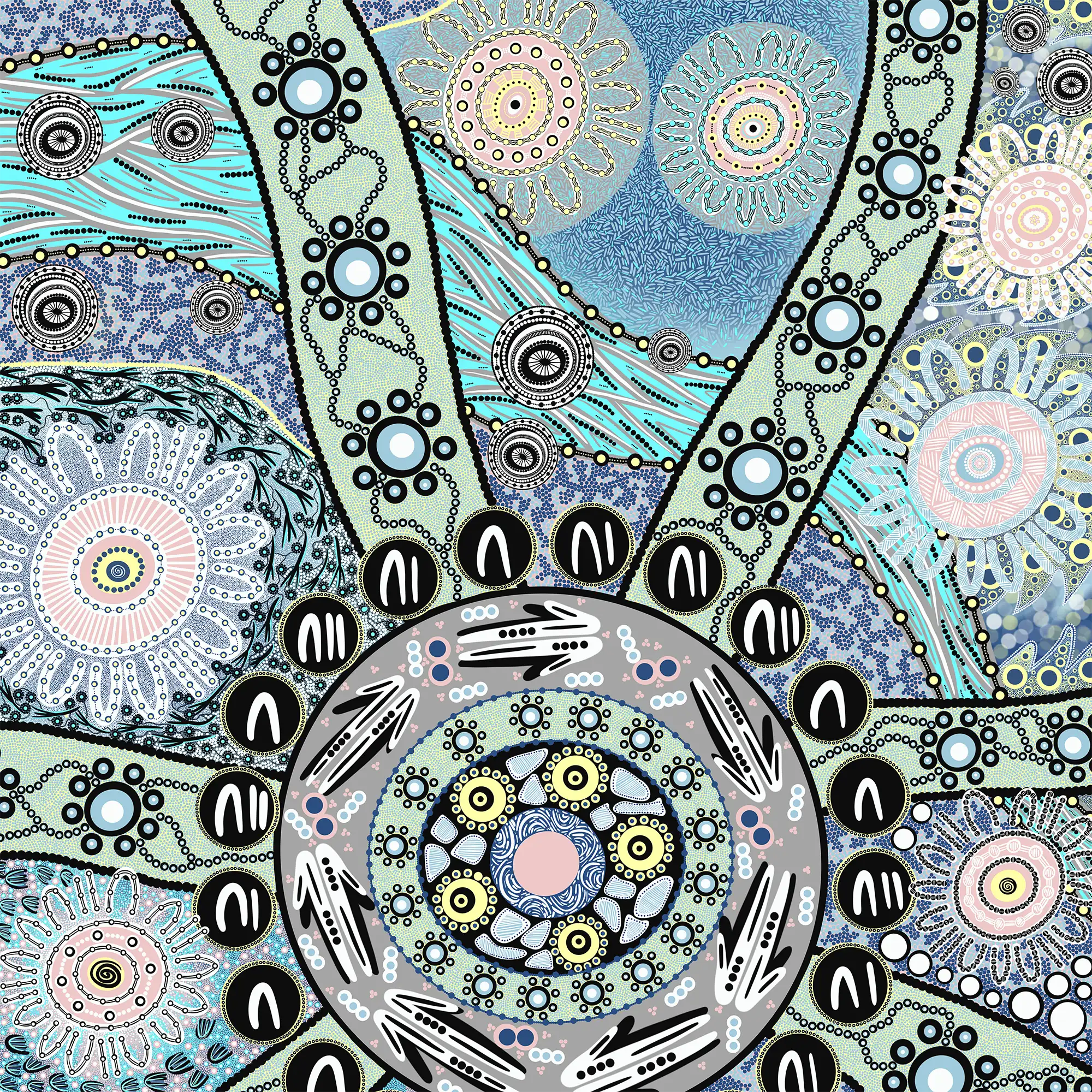
‘We Gather, Together’ (Nina Ross 2023)
Each section in the artwork includes campsite symbols to represent Hunt Hospitality’s portfolio. The symbol of the campsite includes man and woman symbols around each one. This, along with the connected designs within each symbol shows the Institutional Integrity – the Hunt Hospitality Reconciliation Action Plan is working towards with the goals and deliverables set by the RAP Working Group.
The repeated black and white circles throughout the artwork represents opportunities for truth-telling. Standing as a reminder that Australia was and always will be First Nations Land. Acknowledging the true history of Australia will unite and benefit Aboriginal and Torres Strait Islander peoples and all Australians.
Starting on the left of the artwork and traveling across to the right is Coquun (Hunter River) in Wonnarua language. The water is flowing and shows fish swimming along the streams. You will also see there is a path/segment of many dots across the artwork, starting at the top and moving around the centre symbol. These represent the 300+ people who work at Hunt Hospitality. The two shades of light and dark blue represent First Nations and non-Indigenous people who work across the 5 Nations.
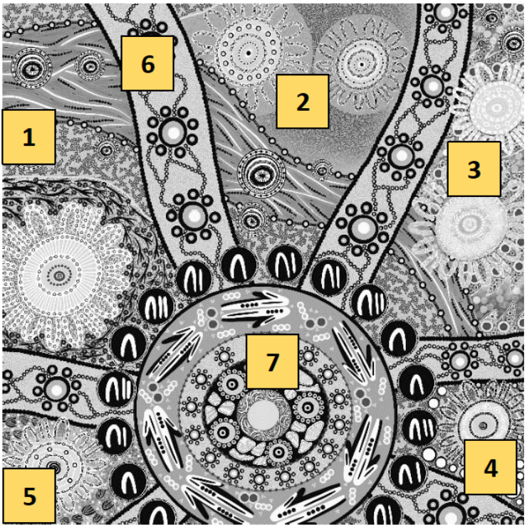 Section 1
Shows the Imperial Hotel on Wonnarua Country with the campsite symbol. Tracks of Kawal, the wedge tail eagle and the Wonnarua Totem surround the campsite. There are small flower symbols connected by stems and vines to show Indigenous flora on Country.
Section 2
Includes the Oceanview Hotel and the Coffs Hotel on Gumbaynggirr Country. These campsite symbols are surrounded by many, many dashes creating expansive space on the composition, symbolising the Gumbaynggirr Totem – saltwater ocean.
Section 3
Displays Finnian’s Tavern and Harrington Hotel on Biripai Country. Throughout the background in this section, you can see multiple fin shapes representing the Biripai Totem – the Shark, and the fins slicing through the Biripai Waters.
Section 4
Shows the Seabreeze Hotel on Worimi Country. White circles represent the bubbles in the Worimi Waters made by the black dolphin, “Wubaray” the Worimi Totem.
Section 5
Includes the Kent Hotel on Awabakal Country. The many pink, turquoise and white dots represent the busy city life seen on Awabakal Country since colonisation occurred, with Newcastle being a secondary penal seblement from 1804 impacting Aboriginal communities across Awabakal from Newcastle to Lake Macquarie. Tracks of Birabaan, the wedged tail eagle and the Awabakal Totem surrounds the campsite, watching and protecting.
Section 6
Across the composition of the artwork shows travelling tracks representing people coming and going and crossing paths – all leading to Hunt Hospitality. The colours are black, white and blue, to represent the Aboriginal, Torres Strait Islander and non-Indigenous peoples coming together in unity. The dots between them show the interconnectedness through history – this represents unjust policies of the past that impacted First Nations peoples and their experiences in public houses – segregation, as well as the abolishment of segregation and the importance to always remember and acknowledge the true history of Australia through historical acceptance.
Section 7
This section is the large concentric circle which is the focal point of the artwork. It is a campsite symbol – the heart of the community. In the middle is an inner circle of water ripples connecting the Freshwater and Saltwater Country across the Hunt Hospitality portfolio. The next ring displays 5 yellow symbols – the sun shining brightly over the 5 Nations: Wonnarua, Gumbaynggirr, Biripai, Worimi, and Awabakal. The shapes with lines in between the sun symbols represent Sacred Sites on each Country. The next ring shows stars at night-time with Hunt Hospitality venues open day and night. The final circle shows arrow symbols, representing people walking together with positive Race Relations, and in between the shapes symbolise Indigenous insects and animals within the Country’s ecosystems. Around the outside of the campsite symbol is black circles with symbols representing man, woman and children. They are all the same size and colour and around the circle no one is above or below – showing Equality and Equity for First Nations peoples. These are the community members and families who come to the Hunt Hospitality venues to relax, connect, and spend their time.
Baayanya By Nina
Phone: 0425 298 034
Email: baayanyabynina@gmail.com
Website: www.baayanyabynina.com
